A step and repeat backdrop has exactly one job: make everyone who poses in front of it look good while your logo rides along in every photo that gets posted. When it falls short, it does so in ways that are painfully visible the next day, when reshooting is impossible. Almost all of those failures trace back to a handful of decisions made before anything was printed. Here are the mistakes worth catching in advance.
Sizing the logos wrong
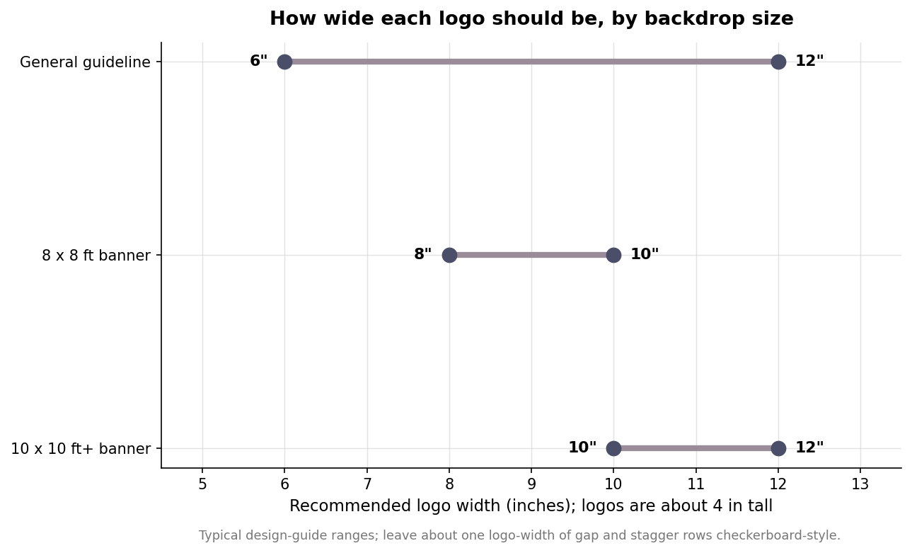
The logo size is the setting people most often get backward. Make the logos too large and only one or two land in a cropped photo, so the wall looks sparse and oddly branded. Make them too small and they blur into unreadable texture once the image is cropped to faces. The workable range is roughly 6 to 12 inches wide and about 4 inches tall. On an 8 by 8 foot banner, aim for 8 to 10 inch logos; on a 10 by 10 or larger wall, go 10 to 12 inches. Leave about one logo’s width of gap between repeats and stagger the rows in a checkerboard so that any tight crop still catches at least one complete, legible mark. If you are placing more than one sponsor or brand on the wall, set a clear hierarchy rather than repeating them at equal size: a dominant primary logo with smaller secondary marks reads far better in a photo than a busy grid of competing logos, all of which end up illegible.
Ordering a glossy finish for a room full of flashes
Finish is a quiet decision with loud consequences. A glossy banner bounces camera flash and bright spotlights straight back into the lens, producing white hot spots that wash out whatever logo happens to sit behind the subject. A matte finish scatters that light and keeps the backdrop reading cleanly in every frame. For any event with flash photography, a media wall, or strong overhead lighting, order matte and do not overthink it. Glossy only earns its place in a controlled setting with soft, indirect light, which describes almost no real event. Material affects sheen too: tension fabric is naturally low-glare and forgiving under mixed lighting, while a standard vinyl banner tends to be shinier, so if you are set on vinyl, ask specifically for a matte or satin laminate rather than assuming the default finish will behave.
Buying the wrong size for the crowd
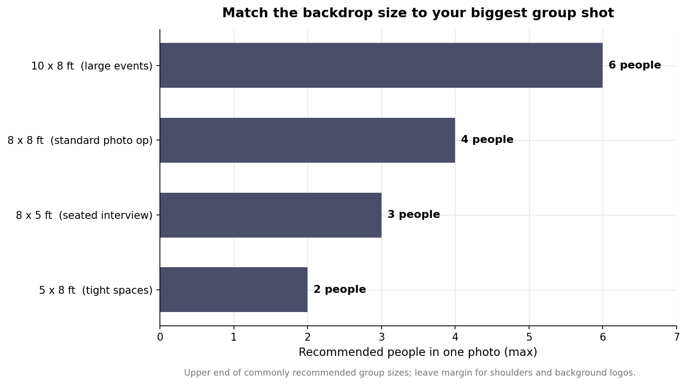
Backdrops are sold in a few standard footprints, and each one has an honest capacity. An 8 by 8 foot wall frames two to four people; a 10 by 8 handles four to six; a 5 by 8 suits one or two; and an 8 foot wide by 5 foot tall layout works for two to three seated guests. Height matters as much as width: an 8 foot tall banner keeps heads below the top edge for standing photos, while a 5 foot tall banner actually photographs better behind a seated interview because it does not tower awkwardly. The classic error is an 8 by 8 backdrop for a six-person grip-and-grin, which crops shoulders and buries the background logos. Size for the largest single group you expect in one shot, then add a little margin. Remember the photographer needs room to work: a tight venue that forces them close to the wall with a wide lens will stretch faces at the edges, so a slightly larger backdrop that lets people stand a step forward, away from the print, usually photographs better than one sized to the exact group.
Sending artwork that cannot hold up at eight feet
Artwork built for the web falls apart at banner scale. Design at the final print size and supply vector art or high-resolution raster so the logos stay crisp when someone stands three feet away. Include the bleed your printer specifies, convert fonts to outlines so nothing reflows, and work in the color space the shop asks for so brand colors do not drift. Pay special attention to the vertical band from roughly waist to head height, where people actually stand: keep the repeat even and complete through that zone so a half-hidden body does not leave an awkward blank next to someone’s face. Send the file in the format your printer requests, usually a press-ready PDF or a native vector file, and always order or approve a proof at scale; a logo that looks fine on a laptop can reveal a low-resolution edge or a color shift only once it is blown up to wall size.
Forgetting the stand, the lights, and the wind
The print is only half the setup. Order an adjustable stand rated for the banner’s size, and choose the substrate deliberately: tension fabric resists wrinkles and travels well, while vinyl is more rigid and usually cheaper but shows creases from folding. Plan the lighting to hit the wall evenly from the front so you are not fighting shadows. And if any part of the event is outdoors, treat wind as the real threat, because a vinyl banner behaves like a sail; weighted or staked bases and a fabric that lets some air through will save the shot. Build in setup time as well: a tension-fabric wall pushes onto its frame in minutes, while a large vinyl banner needs careful hanging to pull out the folds, and neither is something you want to be fighting fifteen minutes before doors open. Walk through logo size, finish, footprint, artwork, and hardware before you approve the proof, and the backdrop will do its one job all night.
Leave a Reply